 It is hard to understate the importance of the Super Nintendo when discussing the legacy of gaming giant, Nintendo. Following fresh on the heels of the insanely successful Nintendo Entertainment System, the console cemented the corporation’s power position in the industry, while simultaneously fending off the vicious onslaught of SEGA in both the United States and abroad. Sure, any retro enthusiast worth their salt looks back fondly on the console, but even the most passionate of gamers lose sight of one key component of the gaming purchase: the box.
For North American folks this general apathy towards the game’s packaging makes quite a bit of sense. Nintendo of America insisted on virtually every game having the exact same design template, with very little opportunity for deviation. What little room was left on the box tended to contain a generic press shot or two, along with the title in big goofy lettering. In Japan, however, it was the Wild Friggin’ West. There were very few restrictions on how games were bundled at retail, let alone any attention paid to the art that these boxes featured. The result was an amazing variety of different types of designs and artistic expressions that were absolutely worth remembering.
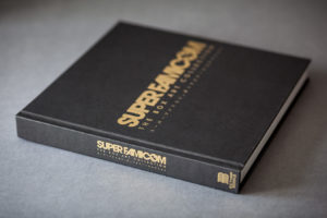
In enters Super Famicom: The Box Art Collection from stage left, to inform the rest of the gaming world what we were missing out on. Published by the team over at Bitmap Books, this collection helps to revive the lost art of the coffee table book, while also preserving over two hundred and fifty of Japan’s most memorable pieces of box art. Admittedly the appeal of a compilation like this might be a bit more limited than most historical gaming publications, but as someone who has fawned over classic games since childhood, this was just something that I had to own for myself. Thankfully, it doesn’t disappoint.
As soon as the introductions are out of the way and the contributors have had the chance to share their own personal blurbs about “why the Super Famicom was so important to them,” and, “how this project was a labor of love,” the meat this tome kicks in. Each page consists of what has to be a damn near scale image of a specific piece of box art, accompanied by the game’s title (in both English and Japanese) the publisher, year of release and genre. This is then followed by what is essentially a synopsis of the game, a few additional interesting anecdotes, and an occasional note about the artist responsible for the actual art featured on the front of the box.
Though this may sound rather pedestrian as far as content goes, it is in the crisp detail of the images and the more off-the-wall behind the scene stories of each game that makes this worth reading. For example, did you know that the game Contra Sprits originally used Arnold Schwarzenegger’s film Raw Deal as its inspiration? Apparently Konami was worried that the game would be deemed too aggressively named for its European release, hence them renaming the title Super Probotector. If that wasn’t enough publisher mandated intervention for you, the developers were also forced to go in and swap out the main characters with robots, just so it was guaranteed to get past the notoriously strict German certification board. Call me crazy, but details like this are absolutely fascinating to read about. Oh, and for those of you wondering if this game came out in North America, you might remember it better as Contra III: The Alien Wars.
Page after page, I was riveted by what I was reading and seeing. Granted, the previous example of deep dives into a title’s background isn’t present for every game, but I can guarantee that each blurb will have at least an interesting detail or two that isn’t widely known by the general public.
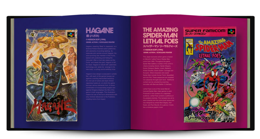
My biggest takeaway from this compilation is related to the extremely compelling pieces of art. First off, the image quality is far and away the best I have ever seen for an anthology of this magnitude. The sheer amount of time it must have taken to both photograph and clean up some of these boxes would have to be far more than I could ever image. It is very obvious that there has been careful attention to detail in preserving each and every piece, as if it were hanging on a wall in a gallery. Secondly, it is fascinating to see just how amazing marketing can look when teams are given the freedom to think outside of the box. (See what I did there?) It makes me wish that North America had the same freedoms with their packaging. Who needs uniformity when you have creativity, right?
Though the content actually printed on the page is the most critical element to any coffee table book, another key piece of the puzzle is the quality of the materials that the book is made from. The hardcover edition that currently resides on my shelf is extremely high quality. Both front and back covers have a finish that almost reminds me of our old, gigantic school dictionaries. It looks very well put together when sitting on a shelf, and even more impressive when laying out on a flat surface. Each actual page is a thick, glossy stock that reminds me more of a classic reference material than a book about game art. Lastly, the binding itself is tightly woven into the hardcover, which means that readers are treated to that satisfying, “new book crinkle,” sound when opening the cover. It is a personal pet peeve of mine when the bindings of a book are way too lose. It results in a product that doesn’t feel as well put together. Luckily this dodges that bullet with ease. Though I will say there are some pages that seem to have not been cut as crisply as others, leading to a few visible rough patches when looking at the book from the side profile. I know that criticism is being nitpicky, but when the actual build quality is this high, you have to dig a little deeper to find problems.
There are only three other areas where I have minor criticisms. For one, it seems like the amount of written content on each page was fairly inconsistent. While some descriptions seemed to be bursting at the seams with information, others seemed a bit more barebones, only filling a quarter of the page. As I have iterated on previous occasions, I am not a fan of blank real estate on a page, unless it was made for a stylistic reason. Secondly, the commentary on each title seemed to steer clear of most information about their North American releases. Obviously the majority of the information revolves around the Japanese release, but why the European releases get so much more attention than the folks on the other side of the Atlantic is beyond me. If there was a legitimate explanation for this, I would be very interested to know. Lastly, I really wish we could see the back cover of these games are well. And before you say anything, yes I do realize that I wouldn’t be able to read a goddamn word of it. I just think it would be interesting to see if some of these full front spanning images carry over to the back, or if there is even more original art on the opposite side. Once again before you run to the comments to tell me I am nuts, just know that I realize that would necessitate a complete change in the layout of the book. This is just more of an, “It would have been nice if…” commentary, rather than an actual criticism.
If the quality of this release is consistent with the rest of the releases in the Bitmap Books stable, I will definitely be checking out more of their back library. Super Famicom: The Box Art Collection is a fantastically well put together book looks as good closed on the table than it does opened. Each page is vibrantly printed and has content that is guaranteed to entertain the inner fanboy in everyone. This is a piece that is well worth adding to any retro-leaning gamer’s library.
